
Overview
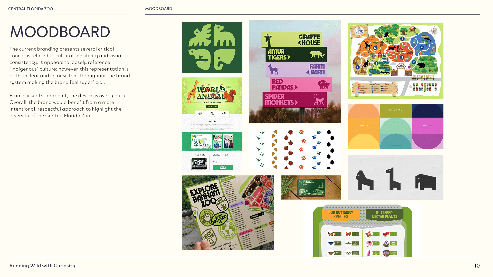
The rebrand focused on shifting away from culturally insensitive elements toward a more thoughtful approach centered on animals and their natural habitats. By prioritizing accurate, habitat-based visuals and a respectful tone, the new identity creates a more educational and inclusive experience. The updated visual language introduces a modern, cohesive system designed to appeal to a wide and diverse audience. As project manager, I ensured design consistency across all deliverables, organized team workflows, and co-developed the brand guide to support a unified and intentional outcome.
CLIENT
Class Project
YEAR
2026
DELIVERABLES
Branded Guideline
ROLE
Designer + Project Manager
Logo Rebrand
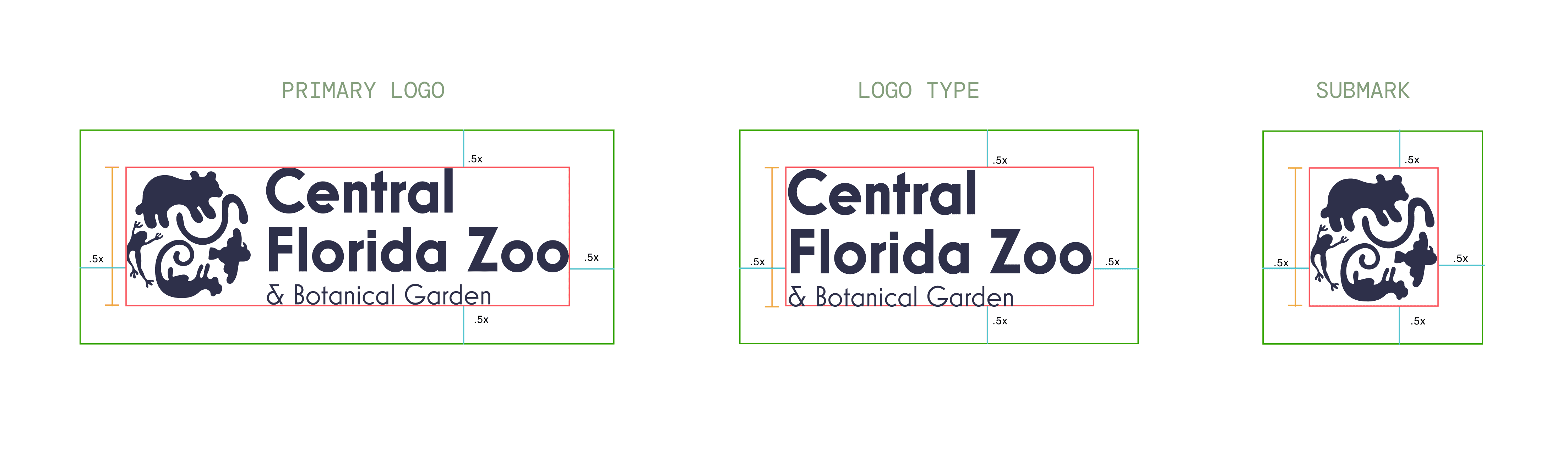
For this project, I focused on selecting a sans-serif typeface to bring a more modern, legible feel to the brand — a step away from the existing logo's dated typography. While my group mates Skye Tiedemann and Natalie Holden developed the symbol, I led the typographic direction: pairing complementary typefaces and establishing a cohesive system for the body copy.
Wayfinding and Access
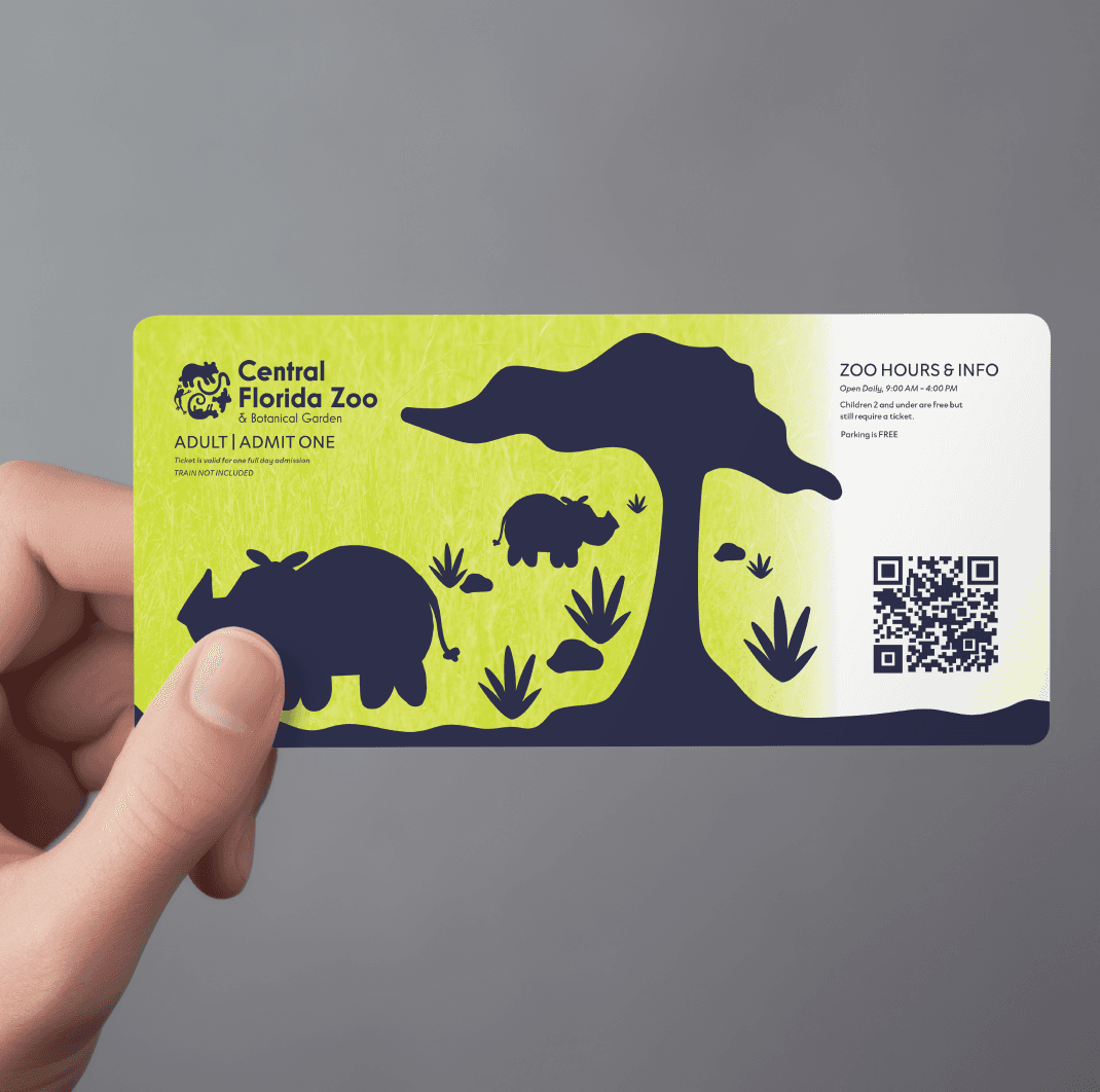
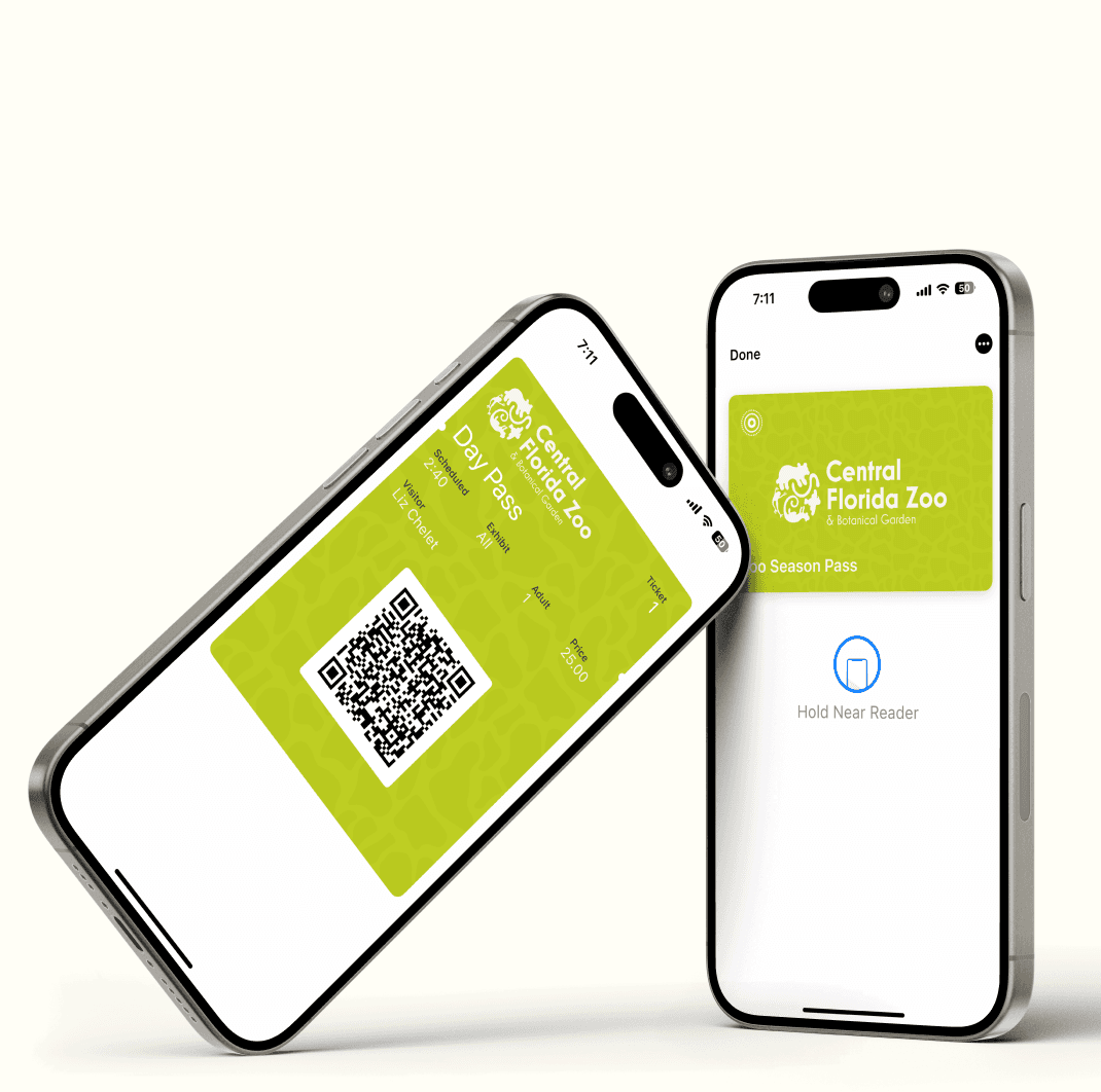
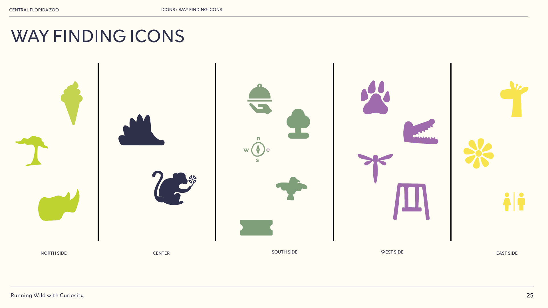
Here is the new visual identity in action. My teammates, Natalie Holden and Maddie Freeman, applied the redesigned logo and typography to a ticket mockup, illustrating how the brand is introduced from a visitor's first interaction with the zoo. I then extended the identity into the wayfinding system by reorganizing the zoo's zones into a cleaner, more intuitive layout and renaming key areas to create distinct, memorable destinations that improve navigation while reinforcing the new brand.








Other projects


